

Colour - The Facts
Colour is everywhere! They are an integral part of our lives, they do an awful lot for humans, they can evoke emotions, set moods, and enrich our visual experiences. As an artist, understanding the colour wheel and colour theory is like having a key that can unlock endless creative adventures.
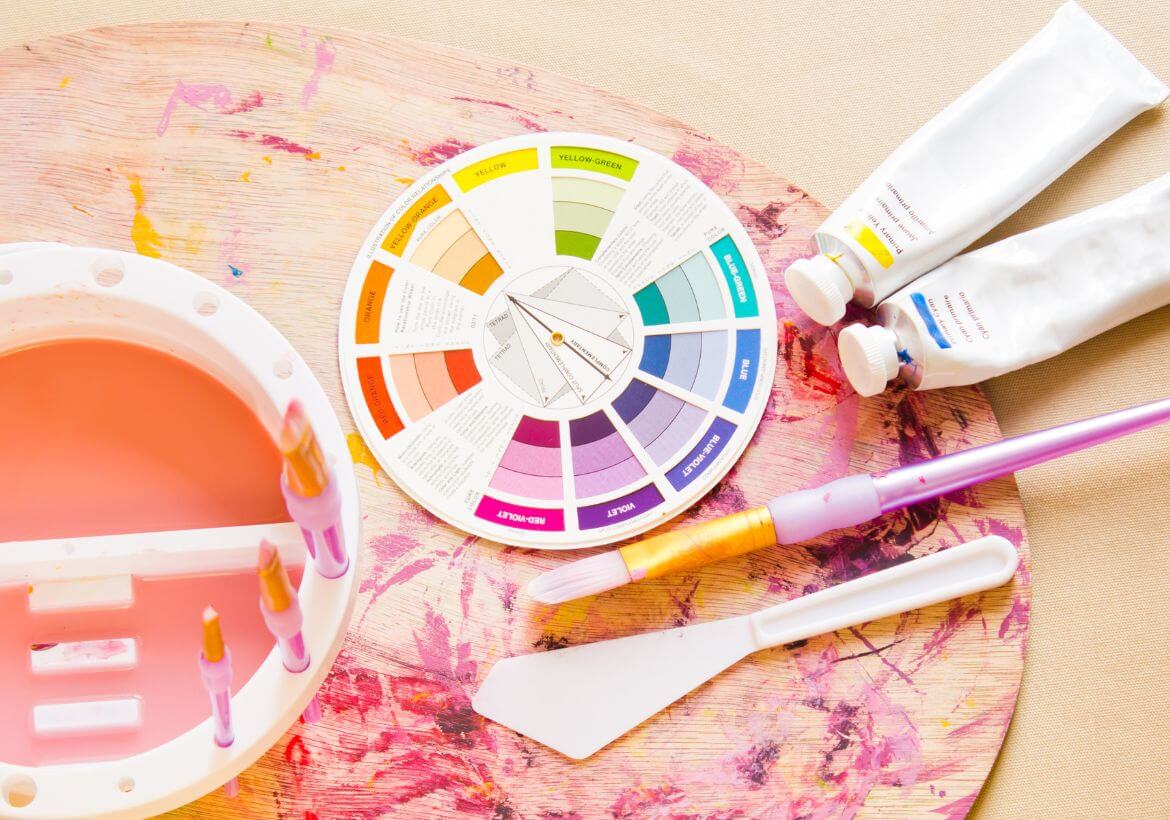
The Colour Wheel
A pretty piece of art kit. A kaleidoscope of hues the colour wheel is a circular representation of colours, showcasing the relationships between primary, secondary, and tertiary colours. It typically consists of 12 colours arranged in a specific order.
The three primary colours are red, blue, and yellow.
They are called primary because they cannot be created by mixing other shades; they are the starting point for all other hues.

When you combine two primary shades (Red, Yellow, or Blue), you get secondary colors. Mixing red and blue creates purple, blue and yellow make (my favorite) green, and red and yellow create orange. These secondary colors are placed between the primary on the colour wheel.
But wait! The magic of mixing does not stop there, because we also have Tertiary colours. Tertiary shades come from mixing a primary with a neighboring secondary. For example, red-orange is a tertiary colour made by mixing red (primary) and orange (secondary). Tertiary colours bridge the gap between the primary and secondary on the colour wheel. Understanding this beautiful wheel helps any creative human identify relationships with colour and how to make informed choices on how to create a sense of balance and harmony within their projects.
Value & Saturation
Value refers to the lightness or darkness of a colour. Tints are lighter versions of a colour created by adding white, while shades are darker versions achieved by adding black. The variations in value allow artists to create dimension and depth in their artwork. For instance, by adding shadows and highlights to an object, you can make it appear three-dimensional and realistic. You can see this technique in a lot of still-life drawings.
Saturation, on the other hand, refers to the intensity or purity of a colour. A fully saturated colour is vivid and bright, while desaturated are muted or greyish. You can test this out by playing around with the saturation on your smartphone camera settings. Saturation can allow artists to evoke specific emotions or moods in their art. High saturation might express excitement or vibrancy, while low saturation can convey a sense of calmness or subtlety.
Psychology of Colour
Colours have the power to influence emotions and evoke specific psychological responses. This concept is known as the psychology of colour. Different colours are associated with various emotions and can affect how viewers perceive and react to art.
For instance:
Red is often linked to passion, energy, and intensity.
Blue is associated with calmness, trust, and serenity.
Yellow is connected with happiness, optimism and warmth.
Green is often seen as representing nature, growth, and harmony.
Purple is linked to luxury, creativity and mystery.
Over the years many artists, advertising companies and a lot of marketing images today have used this knowledge to purposefully choose colours that align with the intended mood or message. By understanding the psychological impact of this, artists and advertisers can effectively communicate ideas and emotions that resonate with viewers on both an aesthetic and emotional level.
A

Annie Dalton
About The Author
Wildlife artist and illustrator, Annie Dalton is fueled by a love for nature and fun stories. Inspired by classics, folklore, and a dash of humor, I hand-draw animals with traditional techniques (pencils, ink, watercolors) in both whimsical and conceptual styles.