Van Gogh Cafe Terrace At Night Mural
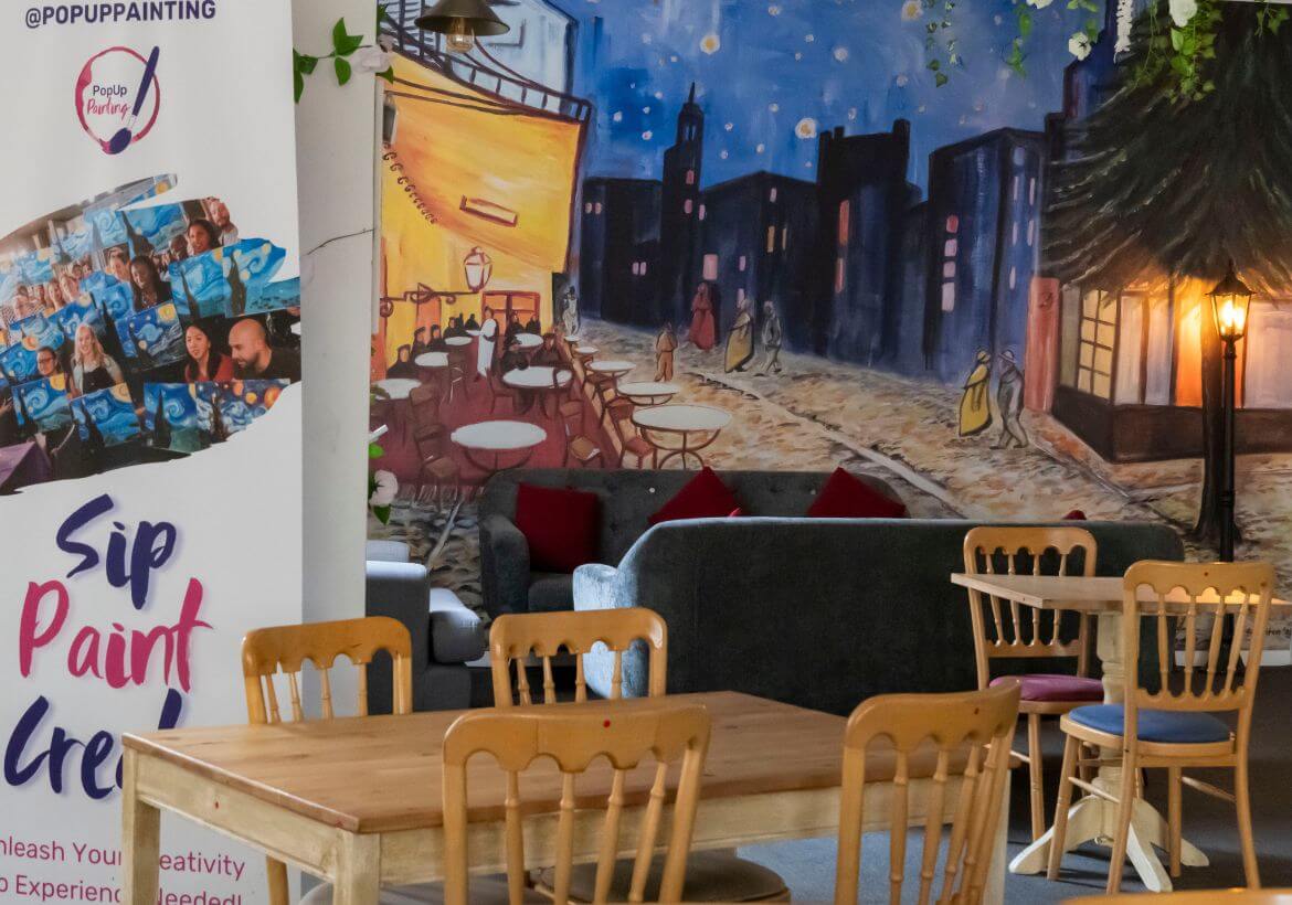
A Van Gogh Cafe Terrace At Night Mural Commission comes your way. Based on one of the most famous paintings in the world. Do you accept or decline?
PopUp Painting survived through lockdown with multiple funny online YouTube lives and Zoom private parties and events. And towards the relief of restrictions lifting it was a do-or-die situation. Get back out and control the events or allow multiple partners we were working with to dictate our survival. Granted most had reasonable doubts due to rules and restrictions still at the time but there had to be an end point some kind of ‘back to normal’. PopUp Painting decided to get there quicker than most and so, the London Art Bar was created.
Initial Thoughts
I have been working with PopUp Painting for nearly 10 years now as an Artist and as their Marketing manager. So when asked to design a Van Gogh-inspired mural for their new premises, I leaped at the chance. A little daunting at first, as the wall was not small, and although I had faith in my ability to paint the image on the wall it was decided that the design would be printed out as wallpaper and placed on it. So a few emails later and some measurements I began my first draft.
Van Gogh’s Cafe Terrace at Night was the theme of this particular space in the Art Bar. The original orientation of the painting is in portrait, so there were elements for this mural, that I needed to take from the painting and reimagine them so that a landscape format made sense. I instantly took to Google Maps!
Maps gave me what I needed to fill in the gaps, so to speak! An understanding of the street where Van Gogh painted this original scene. Though he painted this painting in Arles, France, in 1888 I thought, there surely must be something similar, still on that north eastern corner of the Place du Forum when he set up his easel. Or something new to take inspiration from, anyhow Street View on Google Maps is amazing!
You can see from the sketch that I widened the entrance to the cafe by adding an extra door to give an illusion of more space. The street in the background has also been expanded, and there is less sky – but of course, I kept the important starry night section! Towards the bottom right the curb has been lengthened to match the real-life street so that trees can be added and are more visible. Compared to the original painting.
Sketch

Street View

Branding
Like any good bar, the London Art Bar has branding guidelines that were to be followed. Certain colours were used to outline aspects of the Cafe Terrace, for instance, you can see from the images below that the street lamp is more prominent, and the carpet on the street floor has been roughly coloured to indicate the maroon tone of the bar. I also added this colour to decorate architectural bits of the building and in the not too distant background the window lights.
Coloured Sketch

Original

Finishing touches
Once measurements were finalized and I was given more of an idea of what the space could potentially look like I went back to the drawing board. Sofas and chairs were to be in front of the mural so the important elements of the painting needed to be visible. I raised the street floor and widened the building in the distance just enough so that it still resembled some similar aspects of the Cafe Terrace. For extra branding the London Art Bar logo was added, can you spot it in the images below? 😉


The final painting was completed on canvas in Acrylic paints. As someone who mostly works in Watercolour, this was super valuable to me. Exploring a different medium to what I usually work in was exciting, and challenging. I also took his opportunity to film the process which I have uploaded to my YouTube channel. You can watch the video here the light was not on my side that day and my beautiful cat Salem wandered around, but hey, Akuna mutata!

A

Annie Dalton
About The Author
Wildlife artist and illustrator, Annie Dalton is fueled by a love for nature and fun stories. Inspired by classics, folklore, and a dash of humor, I hand-draw animals with traditional techniques (pencils, ink, watercolors) in both whimsical and conceptual styles.


